Pantone Spring/Summer 2019 Color Palette
Feb 18, 2019 | by Shar Owens
As someone who loves seeing pops of color in event styling, I’m inspired by the Pantone Spring/Summer 2019 color palette. This has to be one of my all-time favorite forecasts from the renowned color experts. The colors in this exciting palette will give life to wedding stationery and decor.
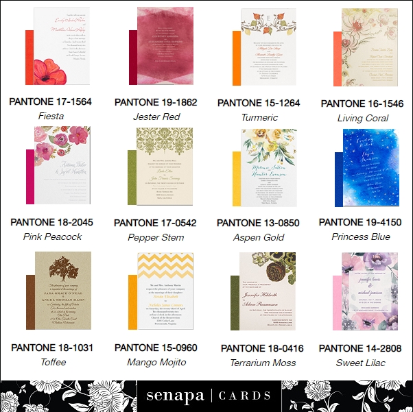
I have a penchant for trees, leaves and perfectly manicured lawns so the green hues, Pepper Stem and Terrarium Moss, catch my eye first. My favorite color is chartreuse (no surprise) which puts Pepper Stem right up my alley. Terrarium Moss strengthens my appreciation for nature. The trunks and branches associated with my beloved trees and leaves are brownish, so a hue like Toffee feels right.
Mimicking sunshine, Aspen Gold evokes feelings of warmth and happiness. Who could be sad around this color? Mango Mojito is a golden, more relaxed shade of yellow which reminds me of sunflowers. Turmeric is a happy orange that adds more life to the palette.
There’s something sassy about red-orange Fiesta and fuchsia-like Pink Peacock is a little flirty, but Jester Red is the more refined member of the red family. If you fancy shades of pink, Sweet Lilac is such a delicate, feminine variety. If you prefer a less-girly pink, you’ll appreciate Living Coral‘s golden undertones. Pantone selected Living Coral as 2019’s Color of the Year because it embodies playful expression and has a lively presence in social media.
In general, blue isn’t a color that moves me but Princess Blue makes me think of Carrie Bradshaw’s (Sex In The City) iconic Manolo Blahniks. I would totally wear those shoes.

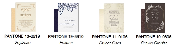
To ground the vibrant gorgeousness of the principal palette, you’ve got to have a team of neutrals and this season’s team delivers beautifully. The buttery richness of Soybean is divine. Sweet Corn is soft and traditional. Brown Granite is strong, steady and somewhat earthy. Again, blue hues don’t usually turn me on but I’m smitten with Eclipse‘s implied drama.

Planning to incorporate any of this forecast’s colors into your wedding stationery or event decor? To give you an idea of how this might look ( we love doing this), each color in the palette has been paired with an aptly-colored invitation (click on an invite if you want to get close and personal):
Couldn’t forget the season’s neutrals. I’m still crushing on Eclipse.